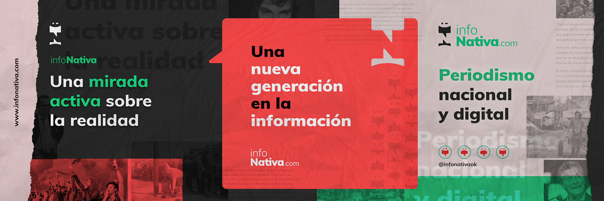
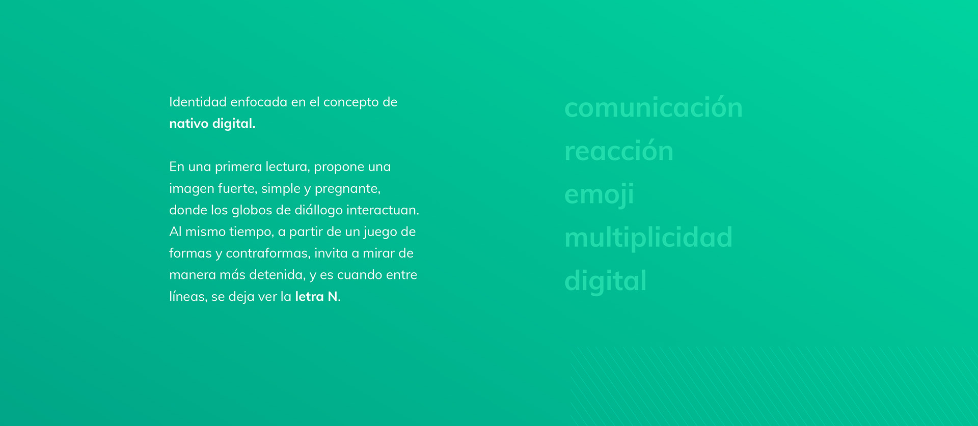
Un medio digital emergente buscaba una identidad acorde al público objetivo: jóvenes de entre 18 y 35 años, en otras palabras, nativos digitales.
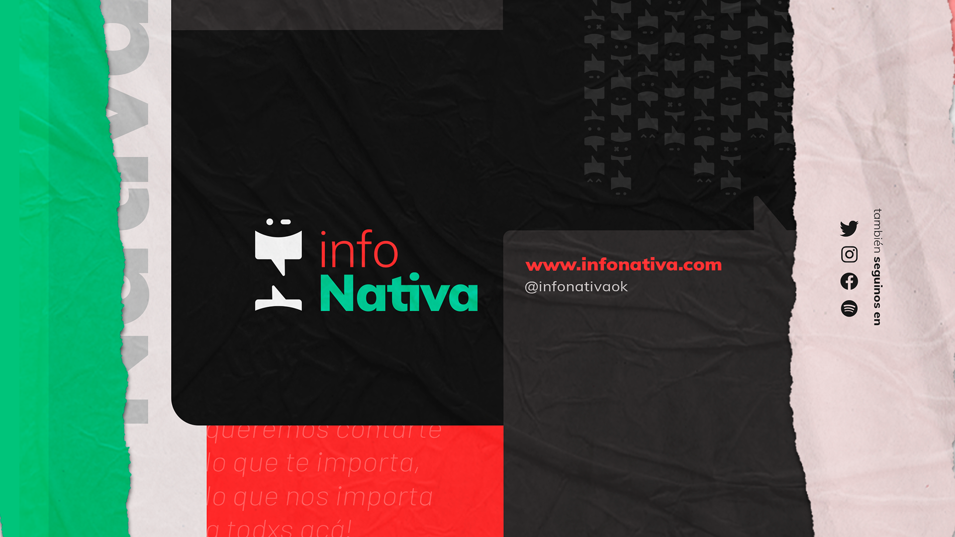
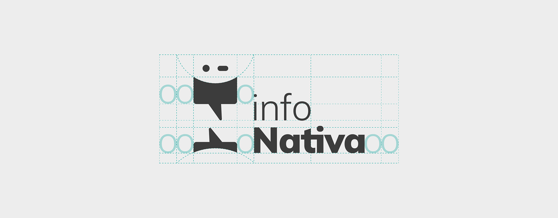
Buscaban una imagen fresca y joven que marcara una ruptura con los medios tradicionales.Esta identidad juega con formas y contraformas. En su ícono, dos globos de diálogo muestran, entre ellos, una N (de nativo) y al mismo tiempo forman un emoji, evocando el lenguaje característico de este público objetivo.
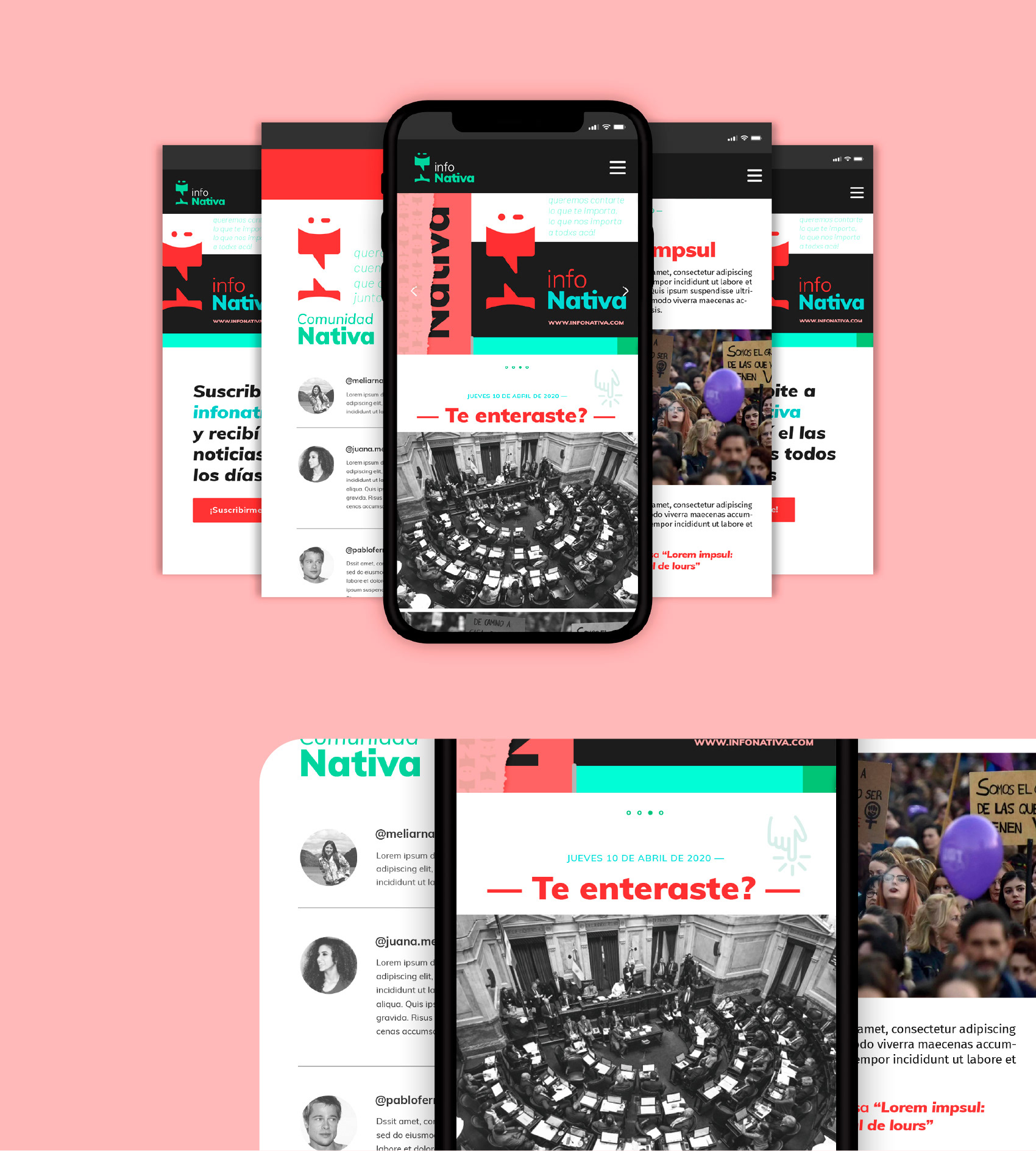
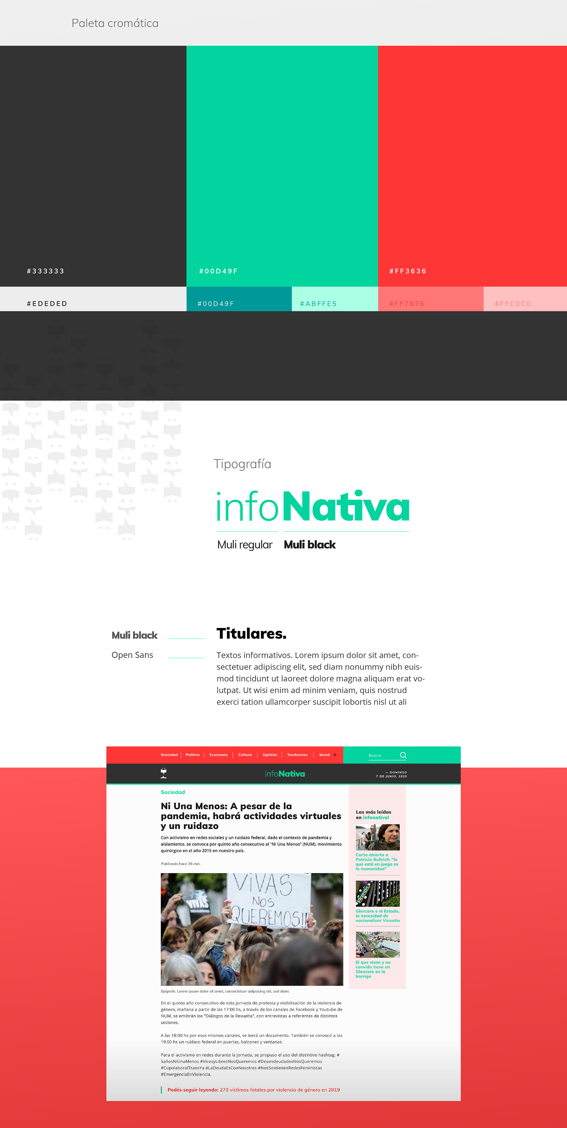
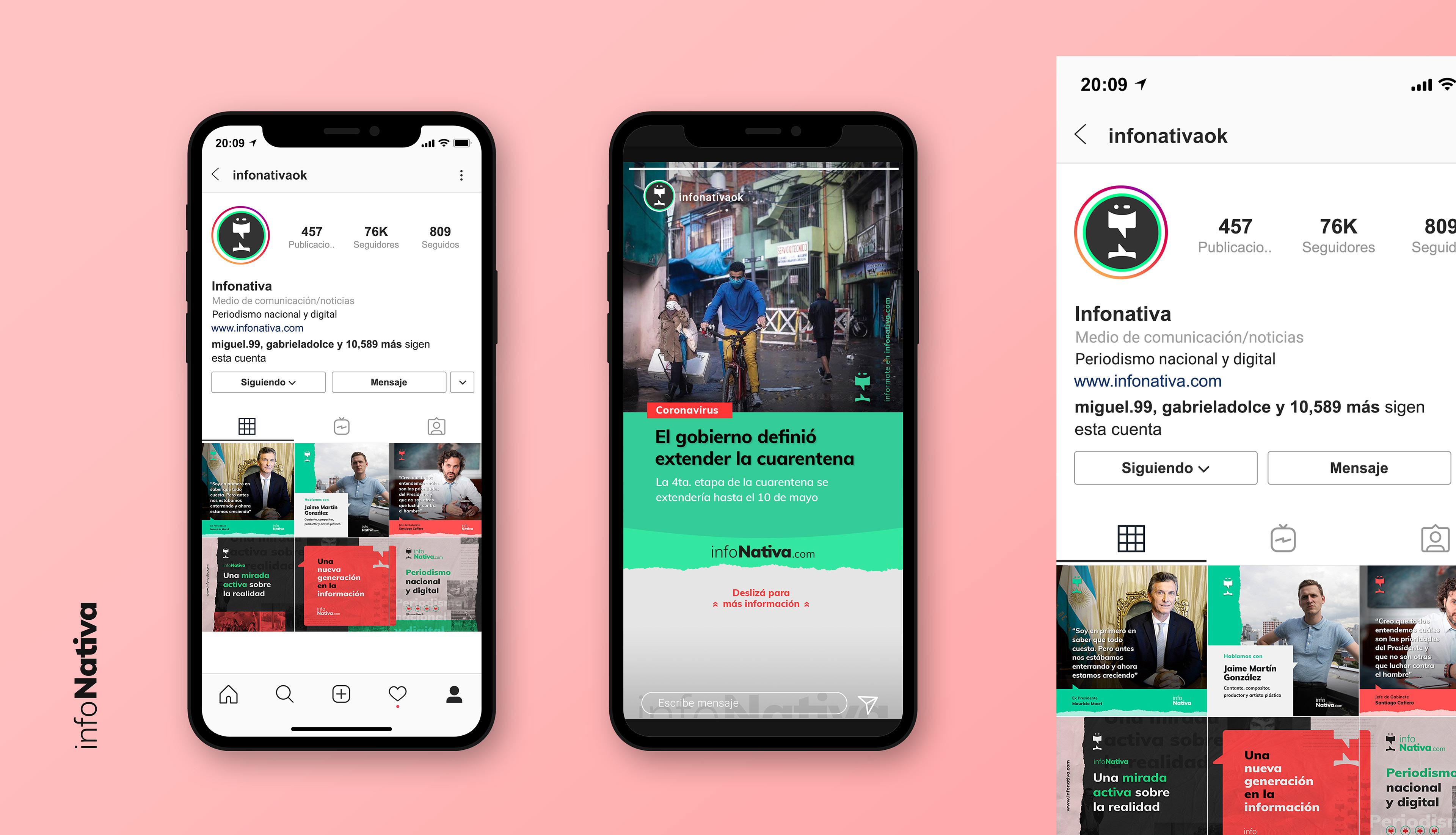
El próximo paso fue llevar la identidad diseñada al diseño de una interfaz de usuario simple, amigable y fácil de navegar para el sitio web donde se publicarían artículos y noticias semanalmente.
EN_
An emerging digital media was looking for an identity according to the target audience: young people between 18 and 35 years old. In other words, those known as digital natives.
They were looking for a fresh, young image that would mark a break from traditional media.
This identity plays with forms and counterforms. In its icon, two speech bubbles show, between them, an N (for native) and at the same time form an emoji, evoking the characteristic language of this target audience.
Afterwards, the identity was turned into the design of a simple, friendly and easy to navigate user interface for the website where articles and news would be published weekly.


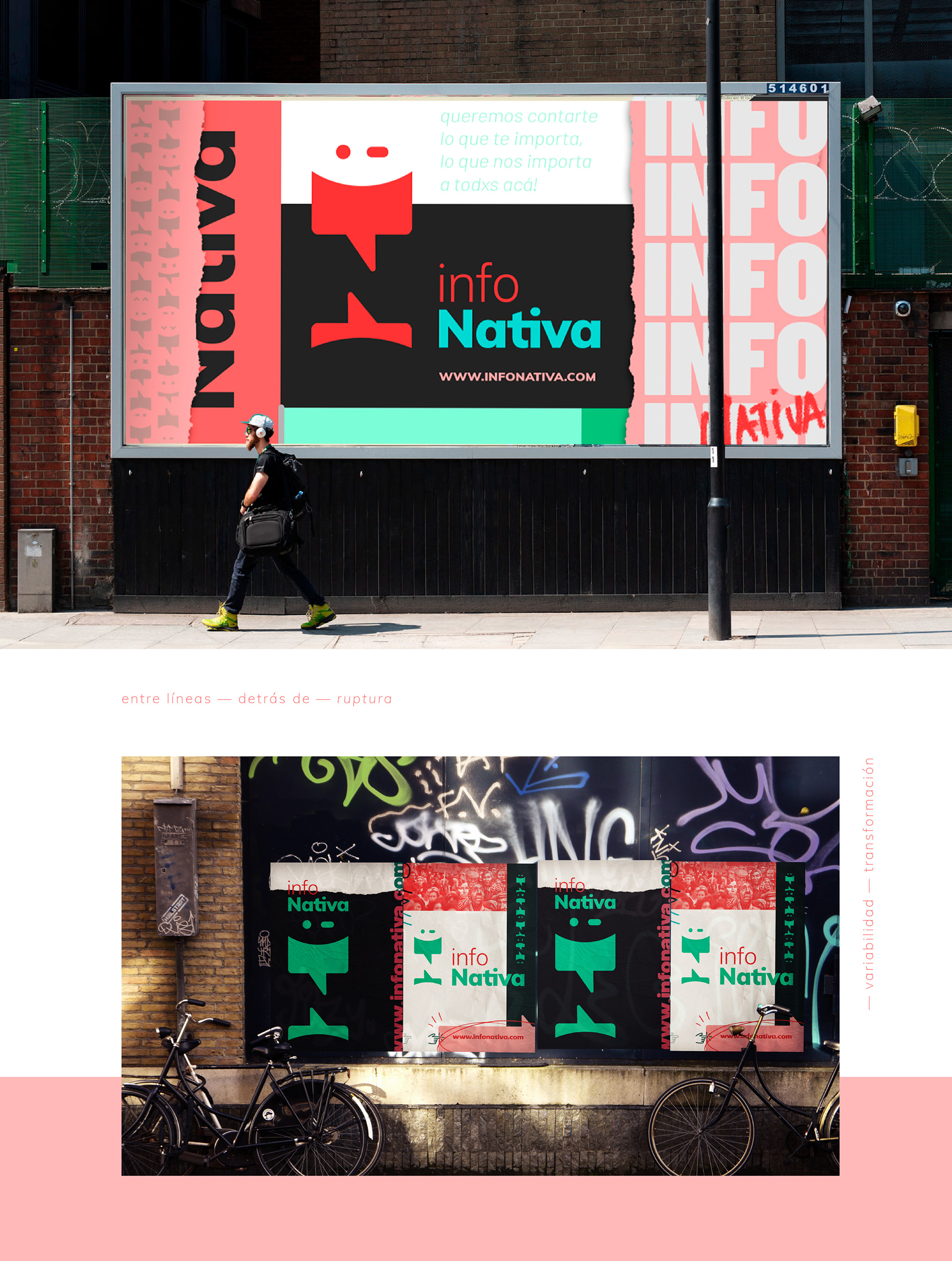
Animación & edición — Campaña de lanzamiento